









Content ITV PRO
This is Itvedant Content department
Business Scenario
Hello talented developers!
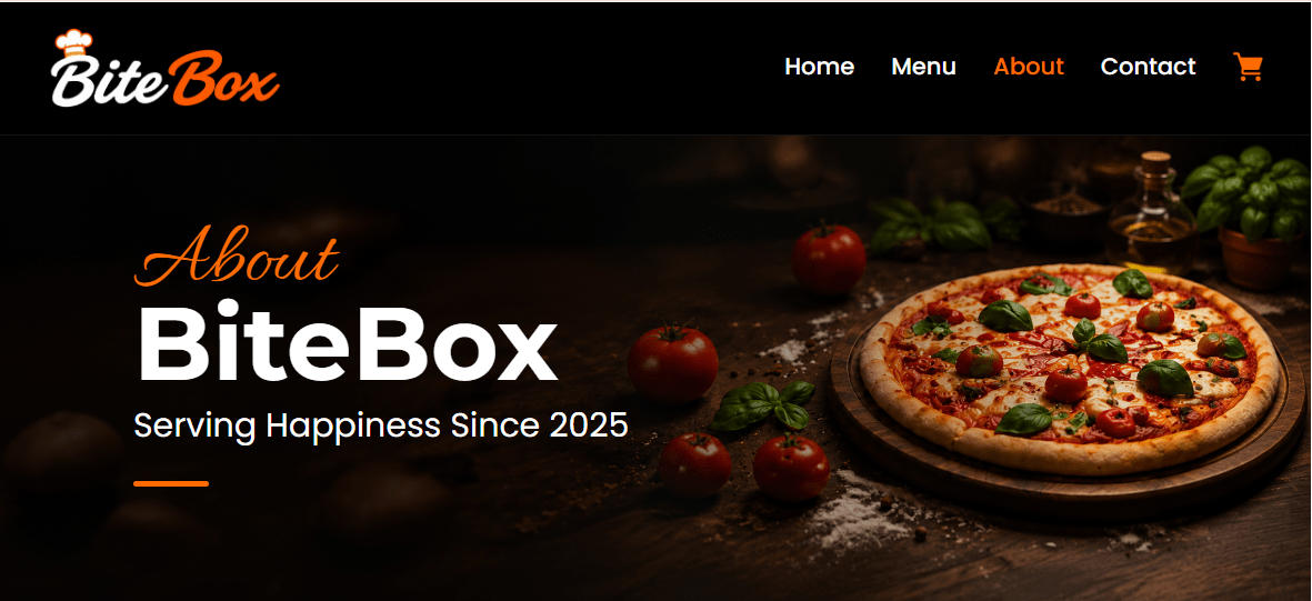
We are done with the HTML and CSS part of our BiteBox website. We have successfully created a beautiful and responsive UI with our Home, Menu, About, Contact, and Cart pages.
But there is one thing still missing...
Our website looks great, but it doesn't really respond to the customer.
Now, the BiteBox restaurant owner wants us to make the website interactive and dynamic.
So, it's time to introduce JavaScript into our BiteBox project!
In this lab, we will connect JavaScript with our existing BiteBox website and start adding basic customer interactions such as welcoming customers, collecting their name, and responding to their choices.
Pre-Lab Preparation
git pull origin branchNameGit Pull
Task 1: Connect JavaScript to BiteBox
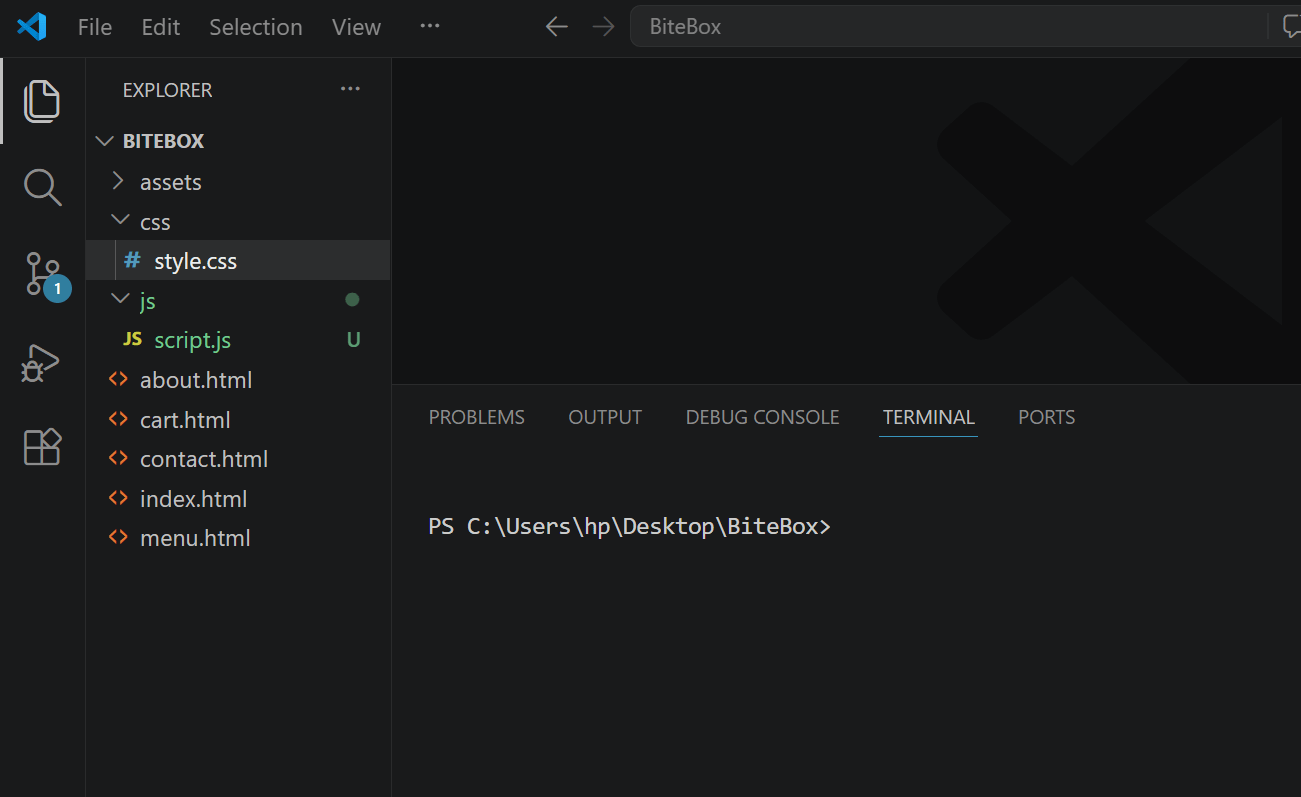
Create a script.js file inside your js folder
1
Module: Journey through JavaScript's Landscape
1) JavaScript: From Script to Superpower
2) Scripting Essentials: From Basics to Execution
Link JavaScript with BiteBox
2
Open your index.html - At the bottom, just before </body> add :
<script src ="js/script.js"> </script>
</body>
</html>
Test the JavaScript Connection
3
Open script.js and add:
console.log("BiteBox JavaScript is working!");Open BiteBox in the browser then: Right Click → Inspect → Console
BiteBox JavaScript is working!
You should see:
If you see that message, our JavaScript connection is working.
Task 2: Add a BiteBox Welcome Message
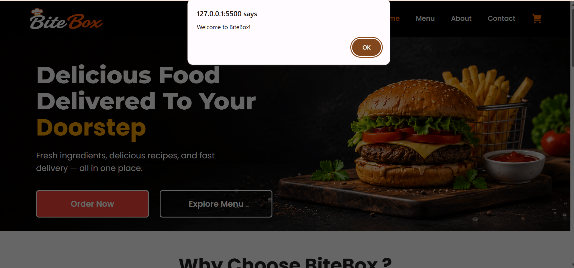
Add a welcome message for the visitors
1
Replace the previous code with:
let restaurantName = "BiteBox";

alert("Welcome to " + restaurantName + "!");
Task 3: Take Customer Name as Input
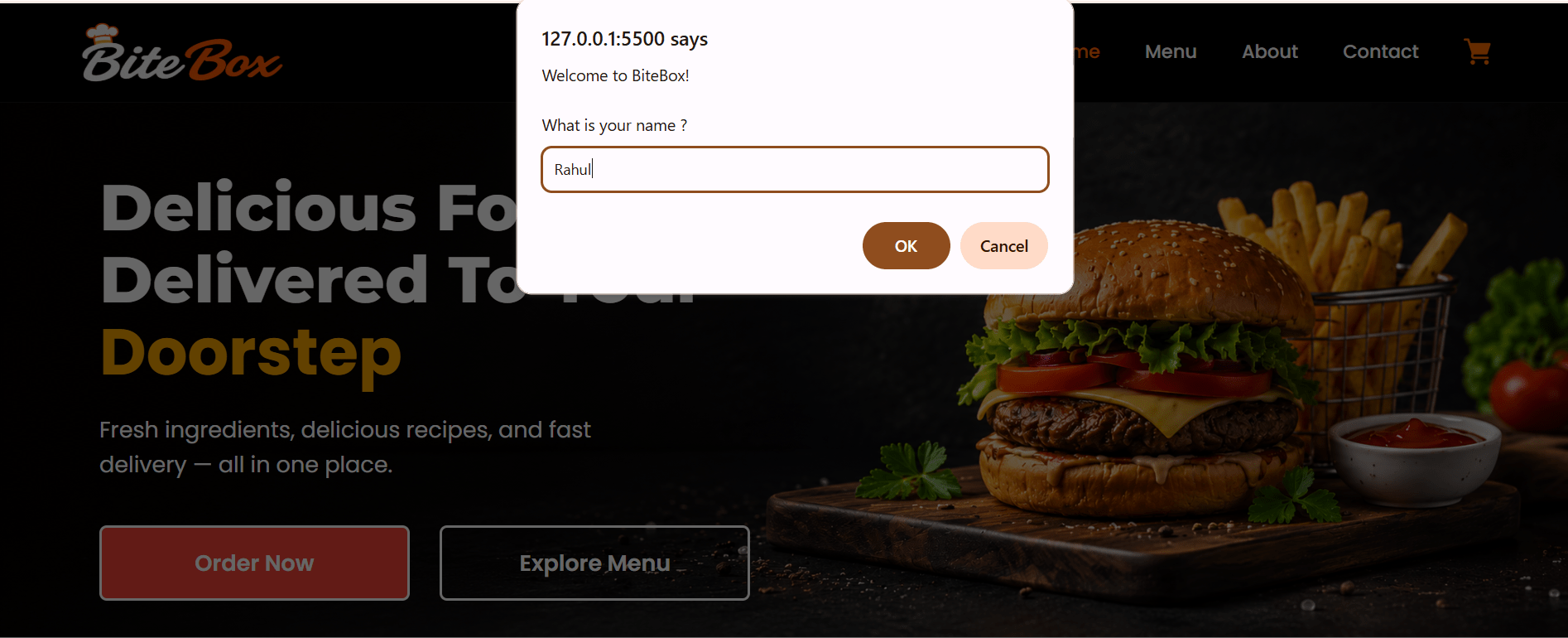
Use prompt() to ask the customer for their name when they visit the BiteBox website.
1
let customerName = prompt(
    "Welcome to " + restaurantName + "!\n\nWhat is your name?"
);
Task 4: Welcome the Customer
Use the customer's name to display a personalized welcome message using alert().
1
alert(
    "Hello " + customerName + "!\n\nWelcome to BiteBox." );
width: 100%;
text-align: center;
}
#about-hero h2 {
font-size: 56px;
line-height: 48px;
margin-bottom: 15px;
}
#about-hero h2 span {
font-size: 48px;
}
#about-hero p {
font-size: 18px;
margin-bottom: 18px;
}
#about-hero hr {
margin: 0 auto;
width: 50px;
}
Tablet Screen :
Mobile Screen
3
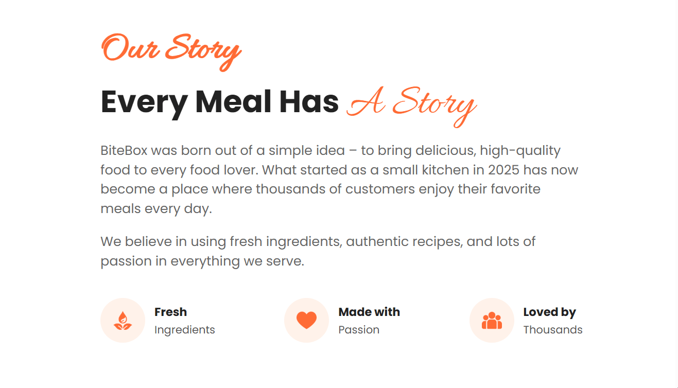
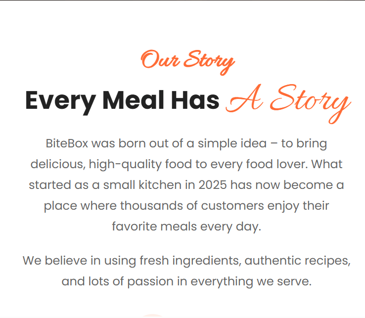
Make the "Our Story" section Responsive for tablet
 #story {
        padding: 80px 120px;
    }

    #story>article {
          display: flex;
align-items: center;
gap: 40px;
}
#story>article>img {
display: none;
}
.story-content {
width: 100%;
}
.story-content small {
font-size: 50px;
}
.story-content h2 {
font-size: 40px;
line-height: 54px;
margin-bottom: 20px;
}
.story-content h2 span {
display: inline-block;
}
.story-content p {
font-size: 17px;
line-height: 25px;
}
.story-features {
gap: 25px;
margin-top: 35px;
} 4
Make the "Our Story" section Responsive for mobile
    #story {
        padding: 60px 20px;
    }
    #story>article {
        display: block;
        text-align: center;
    }
    #story>article>img {
        display: none;
    }
    .story-content {
        width: 100%;
    }
    .story-content small {
        font-size: 35px;
    }
    .story-content h2 {
        font-size: 34px;
        line-height: 44px;
        margin-bottom: 20px;
    }
    .story-content h2 span {
display: inline-block;
}
.story-content p {
font-size: 16px;
line-height: 28px;
margin-bottom: 18px;
}
.story-features {
display: flex;
flex-direction: column;
gap: 20px;
margin-top: 30px;
}
.story-features article {
justify-content: center;
text-align: left;
}Tablet Screen :
Mobile Screen
5
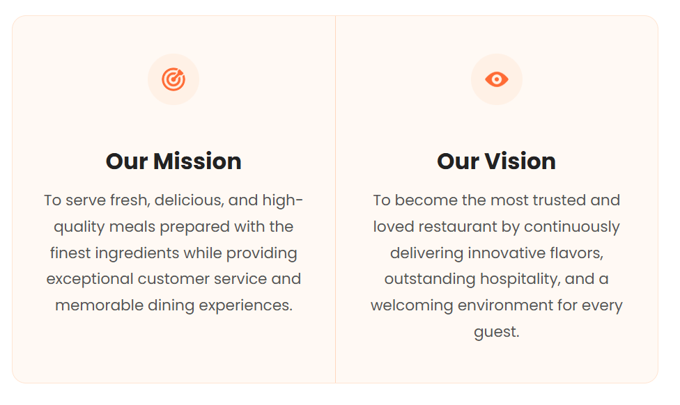
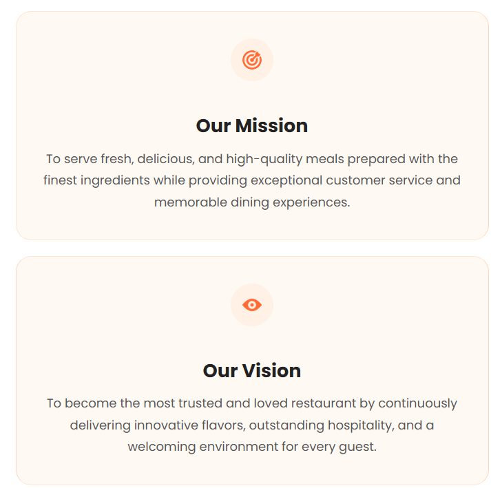
Make the "Vision and Mission" section Responsive for tablet
 #mission-vision{
        padding:80px 40px;
    }
#mission-vision > div{
display:flex;
}
#mission-vision article{
display:flex;
flex-direction:column;
align-items:center;
text-align:center;
padding:40px 30px;
}
#mission-vision article img{
width:55px;
height:55px;
margin-bottom:20px;
}
#mission-vision article > div{
width:100%;
}
#mission-vision h3{
font-size:34px;
margin-bottom:18px;
}
#mission-vision p{
max-width:320px;
margin:0 auto;
font-size:18px;
line-height:32px;
} #mission-vision{
padding:60px 20px;
}
#mission-vision > div{
display:flex;
flex-direction:column;
gap:20px;
}
#mission-vision article{
display:flex;
flex-direction:column;
align-items:center;
text-align:center;
padding:35px 25px;
border-radius:20px;
margin:0;
}6
Make the "Vision and Mission" section Responsive for mobile
    #mission-vision article:first-child,
    #mission-vision article:last-child{
        border-radius:20px;
        border-right:1px solid #ffd7c0;
    }


    #mission-vision article img{
        width:55px;
        height:55px;
        margin-bottom:18px;
    }

    #mission-vision article > div{
        width:100%;
    }

    #mission-vision h3{
        font-size:30px;
        margin-bottom:15px;
    }


    #mission-vision p{
        font-size:16px;
        line-height:28px;
        max-width:100%;
        margin:0 auto;
    }
Tablet Screen :
Mobile Screen
7
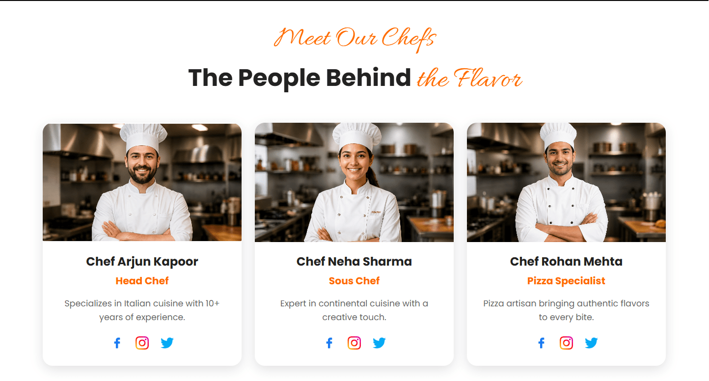
Make the "Meet our chefs" section Responsive for tablet
 #chefs {
        padding: 60px 30px;
    }
#chefs>small {
font-size: 42px;
}
#chefs>h2 {
font-size: 36px;
margin-bottom: 35px;
}
#chefs>h2 span {
font-size: 46px;
}
#chefs>div {
gap: 20px;
}
#chefs article {
width: 300px;
padding-bottom: 18px;
}
#chefs article>img {
height: 180px;
}
#chefs article h3 {
font-size: 18px;
margin: 15px 0 5px;
} #chefs article h4 {
font-size: 15px;
margin-bottom: 12px;
}
#chefs article p {
font-size: 13px;
line-height: 21px;
padding: 0 18px;
margin-bottom: 18px;
}8
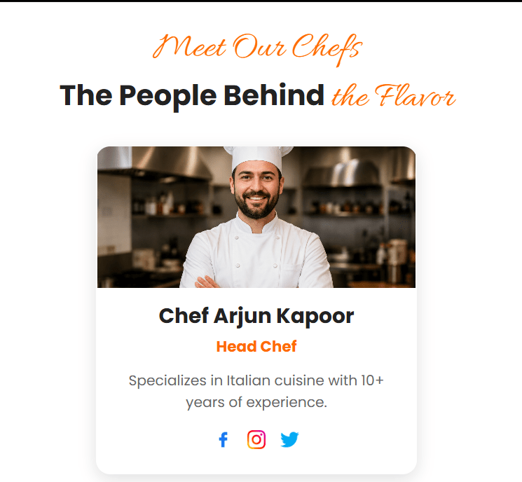
Make the "Meet our chefs" section Responsive for mobile
   #chefs {
        padding: 55px 20px;
        text-align: center;
    }

    #chefs>small {
        font-size: 38px;
    }

    #chefs>h2 {
font-size: 30px;
line-height: 40px;
margin-bottom: 30px;
}
#chefs>h2 span {
font-size: 38px;
}
#chefs>div {
display: flex;
flex-direction: column;
align-items: center;
gap: 25px;
}
#chefs article {
width: 50%;
max-width: 340px;
padding-bottom: 20px;
}
#chefs article>img {
width: 100%;
height: 150px;
object-fit: cover;
} #chefs article h3 {
font-size: 22px;
line-height: 30px;
margin: 15px 0 5px;
}
#chefs article h4 {
font-size: 16px;
margin-bottom: 12px;
}
#chefs article p {
font-size: 15px;
line-height: 23px;
padding: 0 15px;
margin-bottom: 18px;
}
.chef-social {
display: flex;
justify-content: center;
gap: 15px;
}Tablet Screen :
Mobile Screen
9
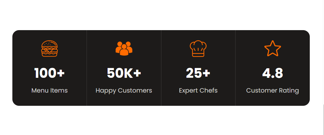
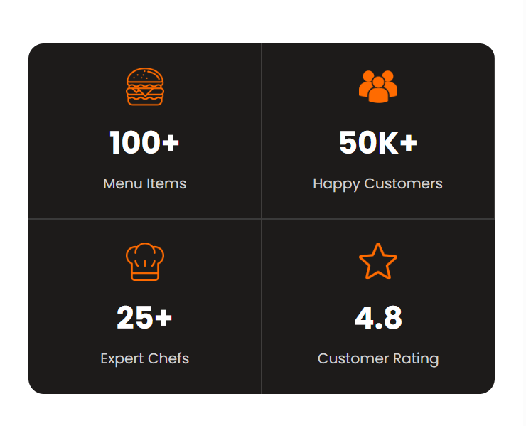
Make the "Restaurant Stats" section Responsive for tablet
    #statistics {
        padding: 60px 30px;
    }
    #statistics>div {
        display: flex;
        justify-content: center;
        align-items: stretch;
        gap: 0;
    }
#statistics article {
flex: 1;
display: flex;
flex-direction: column;
align-items: center;
justify-content: center;
text-align: center;
padding: 25px 10px;
}
#statistics article img {
width: 40px;
height: 40px;
margin-bottom: 15px;
}
#statistics article h3 {
font-size: 32px;
margin: 0 0 8px;
}
#statistics article p {
font-size: 15px;
line-height: 22px;
margin: 0;
text-align: center;
}10
Make the "Restaurant Stats" section Responsive for mobile
    #statistics>div {
        display: grid;
        grid-template-columns: 1fr 1fr;
    }

    #statistics article {
        display: flex;
        flex-direction: column;
        align-items: center;
        justify-content: center;
        text-align: center;
        padding: 25px 10px;
    }

    #statistics article:nth-child(2) {
        border-left: 1px solid #3a3a3a;
    }

    #statistics article:nth-child(3),
    #statistics article:nth-child(4) {
        position: relative;
    }
#statistics article:nth-child(3)::before, #statistics article:nth-child(4)::before {
content: "";
position: absolute;
top: 0;
left: 0;
right: 0;
height: 1px;
background: #3a3a3a;
}
#statistics article:nth-child(4) {
border-left: 1px solid #3a3a3a;
}Tablet Screen :
Mobile Screen
Let’s Take a Pause Here!
We have already made our Header, Home, Menu, and About pages responsive.
But we still have three pages left:
You have to complete the remaining pages on your own by following the same concepts and process that we implemented for the completed pages.
We are done with this lab. The latest source code has been uploaded to GitHub. You can access the latest commit using the link below:
Great job!
You successfully enhanced the BiteBox website by making it responsive.
Checkpoint
Git Push
git push origin branchNameNext-Lab Preparation
Module: Journey through JavaScript's Landscape
1) JavaScript: From Script to Superpower
2) Scripting Essentials: From Basics to Execution
By Content ITV